Friday, 26 June 2015

Keith Neegus - Organic vs Synthetic


I have been blessed with the opportunity to talk to an existing artist who has been in many bands and is currently active in the music industry right now. I will be contacting him with my peers via video conference and will be asking him about his album artwork. I have analysed his album artworks below. I will be focusing on the estimated genre of the albums and will be giving my own insight and opinions as to whether the band/artist is synthetic or organic - Keith Neegus' theory.

Marlowe - 
"It's turning me on".

I couldn't say whether the album artwork belongs to an artist or a band as the cartoon style image of a woman is vague and clearly not a representation of a band member due to its retro style. I researched the album and it turns out Marlowe is a band.

I think the band is organic as there doesn't appear to be any obvious techniques implemented in order to sell copies of the album, for example the style of the album artwork may appeal to those that have a liking for a retro sound...so you could argue that the album was designed to sell copies and that the band is synthetic...but I would argue against that due to the small level of success of the band that the artwork wasn't designed to make millions in sales.

I would say that the genre of music is alternative rock, I say this due to the strong symbolic conventions tied to the colour red, red is often associated with the rock genre, yet I don't think that the band is entirely rock due to their minimalistic portrayal of a woman gently applying lipstick, this leads me to believe that though the band plays rock music yet with the more relaxed sound of the late 60's/early 70's..similar to the Beatles maybe.

Overall I think the album artwork creates a retro feel, it shows few conventions of genre which makes it difficult to analyse but it is very bold and would therefore stand out on a shelf of albums. From the album artwork alone I wouldn't buy the album but it might be something i'd be interested in trying out from the perspective of a potential audience member.

QUESTION FOR THE MUSICIAN: What were the decisions behind animation and simplistic text? 
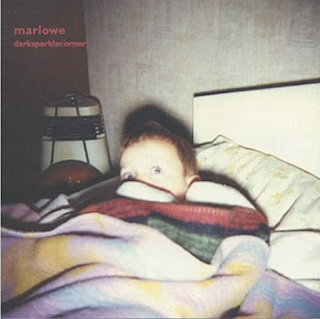


Marlowe - "Darksparklecorner".

Again with the artwork for an album by the band Marlowe I wouldn't be able to tell if the album belonged to an artist or a band, the message is vague and doesn't really tell me much about the contents of the album other than perhaps that the band produces weird and abstract music. 

Again from this album I would say that the band is organic as the album cover doesn't show the band in a glorified way and doesn't appear to be trying to sell an image, but is instead trying to promote the abnormal style of music.

This album artwork would lead me to think that the genre of music is underground indie grunge, appealing to people that live the underground clubbing lifestyle as the image on the cover is in the style of the kind of photos that are produced and shared on the internet by that sort of audience.

I personally don't like this album artwork as I feel that the band is pushing to hard to be weird and out there, and I struggle to draw meaning from the artwork. I haven't listened to the music but I still feel that the child on the cover would have little relevance to the music on the album which I guess for this genre would sort of make sense...but in my opinion the album artwork should reflect the music inside the album to make more sense for the audiences buying the album.

QUESTION FOR THE MUSICIAN: Is there a symbolism behind your idea? And use of a child?


 Marlowe - 
"a day in july".

Despite the album artwork being yet again abstract and unclear as to whether it belongs to a singular artist or a band, I would sway more toward the idea that the album belongs to a band due to the group of people on the album artwork. There are three children on the cover which differs from the last two album covers which had only a singular subject matter (a woman or a child) Seeing a small group of people on the cover subconsciously places an image of more than one person creating the music in the audience's heads.

The album artwork here makes me think that the band is organic yet again as there are AGAIN no industry techniques implemented to glorify or glamourise the band and sell the image in that sense. Instead a nice scenery with non-english children are used to position the most likely english audience somewhere far away from their home, to instil a feeling of tranquility and peace in their minds.

I think the genre of the band would be soft-rock from looking at this album cover as there is an element of a traditional and retro musical sound alongside the scenic peacefulness, unless the band is going for intense juxtaposition by using such a mellow photograph as their album cover and then slapping the audience with hardcore death metal...but that seems unlikely.

I like this album artwork, as a photographer I am drawn to the scenic landscapes and visually appealing composition of this artwork. I also like to look further into an image and to me the children represent the band members, the child standing up is the strongest, most confident and headstrong band member, his head is aligned with the top layer of the images, the sky. The child looks directly at the camera, again showing confidence and bravery. The other two children sit and are engaged with one another, not concentrating on their surroundings, their heads are aligned beneath the first level of the image. This would suggest to me that the child standing up is a band member that shows potential to move on toward bigger things in the music industry, and the other two will be left playing their music to the smaller groups of people in the lower ranks of the music industry. Either way the band as a whole is faced with the adversity of the music industry, and are looking out to an almost unassailable challenge. 

QUESTION FOR THE MUSICIAN: What does the name of the album mean to you? What is the significance? 
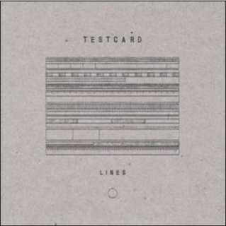
Tescard - 
"Lines".

I would say that this album belongs to a band as the band's name is so abstract and unclear. Usually an artist would use their name, where as a band would 9 times out of 10 use the name of some kind of object/animal etc.

I would again say that this band is organic rather than synthetic due to the weird name and odd choice of album artwork. However had I seen this band releasing an album that made it to the top of the charts there is a large chance that I would think hat the band is synthetic and is using the ambiguity of the artwork/band name as a way of appealing to alternative audiences.

I would say that the genre of the band is alternative rock/indie rock. With heavy emphasis on the instrumental sound of the songs rather than the lyrics...usually when bands' albums look like this they tend to sing about a load of random rubbish, this is due to them wanting the track to sound more artistic and different.

As for my personal opinion on the album artwork, I am both underwhelmed and quite frankly bored just looking at it. YES it may be artistically deliberate in the message it is trying to convey. Without hearing the track I cannot say what the intentions of the band are but there may be a possibility that the music of the album is both vibrant and juxtaposes the bland cover, or maybe that the band sings about the monotonous process of standardised tests and sing about it in their songs, but as a potential consumer of the album I couldn't see myself picking out this album in a music store, it simply doesn't stand out and I'm the opposite of intrigued to find out what the music sounds like.

QUESTION FOR THE MUSICIAN: The artwork suggests a certain monotony, are you making a political statement? Does the music attached to the album correspond to such a statement? 
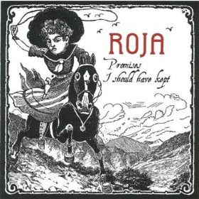


Roja - 
"Promises I should have kept"

This album cover reveals little about the band/artists. Roja in spanish means red - hence why the only colour on this album artwork is red and the only place where that colour is distributed is on the title of the band/artist: Roja - Red. Red has connotations of passion, love, hate, anger etc. It arguably the most striking and visually alluring colour of all, so one would think that the music accompanying this album would be angry, passionate, heartfelt etc. But to me the artwork suggests otherwise. The black and white illustrated style of the album YET AGAIN suggests an indie/alternative genre, one that I am not naturally drawn toward. The illustration is of a stereotypically spanish woman riding a horse, a holstered gun is visible on her hip and she wields a lasso - the horse is galloping along an overcast Spanish mountain-scape. When the image is examined and described in such optimism there isn't any reason why you WOULDN'T pick that album of the shelf, however due to the fact that it is illustrated in the style of a 14 year old's doodles I am in no way attracted to this album. The image is contradictory to its meaning and subverts the overarching intention of the production of the album - which is to sell copies. If I haven't mentioned yet I think that the album belongs to a band as there aren't many people called red, however there ARE bands that are named after colours, for example the once famous boy band comprised of heart-throbs: Blue. People actually bought their albums, because they were designed to sell. They showed band members looking directly into the cameras and wearing minimal clothing, the members themselves were a pubescent girl's dream. However Blue were by no doubt a synthetic band, where as I feel that Roja is organic. I expect Roja to be again an alternative/indie rock band, (excuse the repetition but it does make sense considering one of the musicians has been in ALL of these bands and you don't see Ozzy Osbourne joining One direction) and the conventions of the album artwork reflect this. I don't like this album artwork, it gives off bad vibes and from just the looks of it I know that in a store-scenario I would think that the music is scruffy and trying too hard to be individual, and specifically i'd think that the music of the album would sound like gypsey folk music from the visuals of the cover...i'm not into that kind of music.

QUESTION FOR THE MUSICIAN: Why did you decide to illustrate the album cover instead of using a photograph? And what is the significance of the spanish woman on a horse?


Monday, 22 June 2015

Wordpress Website - Scroobius Pip.


I created a website using wordpress, I chose the spoken word poet/rap artist Scroobius Pip to create a website for. I didn't want to chose an artist that was high-key to create more of a challenge when applying Dyer's star theory. At first wordpress proved to be challenging when creating the website, for example on my laptop a lot of the controls weren't compatible. I had to log onto a local desktop to upload the photos and videos to the website. 

So the first thing audiences would see when they load onto the website is a half-screen image of the artist, Scroobius Pip and in a large font the name of the artist is on top of the image to reinforce the brand. The image of the artist shows him singing  and looking out to his fans at a concert, sporting his classic beard and cap which agin reinforces the trademarked image he's created during his time performing and making music commercially.


The template I used for the website uses a menu system that you click onto from the homepage, at any point when browsing the webpage the main image and a single post is visible to the viewer. Once you've clicked on the homepage all of the posts on the website are visible and are then accessible easily. I posted on the website as if i was the artist, the first post is called "Introdiction"as that is the name of the musci video I uploaded, and rather intelligently if I don't say so myself the word Introdiction is quite similar to the word Introduction. Pure Genius. Anyway, I posted the music video and captioned it:

"Fresh tune - Introdiction, a little angrier than usual, deal with it. Excuse my profanity."


The language I used was similar to various social media posts the artist had made before, addressing the audience in a very upfront and bold manner, This is the 2nd instance where I applied Dyer's star theory to the website, by addressing the audiences in such a way it puts the artist in a position of power and admiration. Also the direct address and casual talk makes the audience feel close to the artist, and yet distant as he establishes his position above them in the industrial hierarchy - making him present, yet absent.


I then uploaded 3 other videos by Scroobius pip, of recent and from previous years. Each of the videos is accompanied by a quote either by Scroobius Pip from talks or social media posts, or from his music videos and lyrical choices. This reinforces the brand YET AGAIN (there's a theme here)  


I entitled a non-video post "Disciples" to again reinforce that he is an untouchable commodity, and that the audiences that follow him are his loyal subordinates. 

By saying that "Thou shalt be condemned if thou does'nt listen to the lyrical miracle of Pip." I am referring to one of his most famous releases "Thou shalt always kill" which refers to the imperfections of the modern human race, which actually tells people NOT to idolise bands and artists which is funny because i'm showing how he is almost instructing his audiences to idolise him. ha. 

I use the quote "beauty is in the eye of the beholder to appeal to the hardcore Scroobius pip fans that will have heard Tommy C, which incidentally is a post based around that music video that I made previously on the website. Again the quote reinforces THE BRAND of Scroobius Pip. I also attached a photograph of Pip dropping some mad free-styling bars at UFC Berlin, where he famously turned some hardcore haters into devoted fans. 

Friday, 19 June 2015

Wordpress Website - Scroobius Pip


I have explored the software Wordpress by making a website for an existing spoken-word/rap artist Scroobius Pip. I have applied Dyer's three pillars to the website to demonstrate his theories and to recreate a realistic website.


Monday, 15 June 2015

Andrew Goodwin

Narrative Theory

Goodwin's narrative theory is fuelled by the notion that music videos don't follow a traditional narrative structure. Goodwin has created three categories in which all music videos fall. These are:

Illustration -  Where the video tells the story of the lyrics, dance may be used to express feelings/moods in the song.


In the case of the music video for Ed Sheeran's "Bloodtream" there is a clear narrative that follows an ex musician that has reached the end of his career and dwells in the loneliness of his current living situation, seeking comfort in prostitutes and alcohol. The Reason why this video falls under the category of Illustration is that there are many visual links to the lyrics being sung, for example: "I've been spending all my time, couple' women by my side, I've got sinnin' on my mind, sippin' on red wine" What we see on screen is a man drinking reflecting upon his antics. The video accompanies the song and makes sense to the audience.


Amplification - The images amplify the lyrics as a narrative to convey a deeper meaning that would not be picked up from the lyrics alone. The artists may take on fictional roles within the narrative.


In the case of this music video by A$AP Rocky, a rap artist, the visuals AMPLIFY the lyrics, making the meaning of the music video more obvious to the audience. Rocky raps about taking the hallucinogenic substance "LSD", of which the stereotypical mental effects are bright colours and a distorted view of the regular world. The whole video is shot through the perspective of someone on the drug, and though the actions on screen may not match the lyrics exactly the music video supports the song strongly and its clear what the rapper is singing about.

Disjuncture - When there is no connection between the lyrics and the video, or when the song and the video totally juxtapose one another.


As for this music video, the visuals don't match the lyrics whatsoever. This tends to be a theme with Die Antwoord, the artist responsible for this music video. The essence of the disjuncture category is total juxtaposition and contrast between the music video and the lyrics of the song. 

Thursday, 4 June 2015

Analysis of Madonna's "Like a prayer" music video

Analysis of Music Video
“Like a prayer” - Madonna


I will be analysing the music video of “Fells like a prayer” by Madonna, focusing on technical conventions, symbolic conventions and my own opinion and understanding of the narrative of the video.

The music video itself stirred a great deal of controversy when it was released in 1989, this is mainly due to the bold statements made against the catholic church and the negative connotations used to represent the Catholic religion in general. The video confronts racism in an incredibly bold manor, not only attacking racism in general, but seemingly laying the blame on Catholicism as a religion in general, and if she wasn’t then she certainly made it look like she did. Evidence for this notion comes in the form of the narrative of the music video as well as symbolic conventions supported by the use of technical conventions such as Camera work and Editing. I will begin with the narrative.
The music Video follows Madonna as she struggles with the decision to stand against the thugs in court and testify to the gang rape and murder of a woman by the hands of a group of white men, freeing an innocent black man from imprisonment. She seeks hospis in a Catholic church where a black jesus is presented to her behind bars. She brings him to life and engages in what is insinuated to be sex with him in the church. The general tone of the music video is that racism is bad, Catholicism is bad and empathy for one another regardless of race is the way forward.
At the time of the release of the music video racism was still a huge issue in America, much like the present day what with the baltimore rioting and the contemporary issue of police brutality against ethnic minorities, more so at the time extremely racist and backwards views were sprouting out of Southern U.S.A, the home of Christianity and the Catholic church in America. The symbolic conventions of the music video that really stand out to me due to the justified and at times confusing connotations are as follows: Burning crosses constantly make an appearance, the trademark symbol of the Ku Klux Klan that are to this day a viscously racist hate group from the south of the U.S. Madonna can be seen dancing in front of the burning cross, these crosses were used as a form of warning/celebration ceremony that would be carried out when the group would go out and murder black people by burning down their houses or beating them to death brutally. So Madonna dancing and singing in front of the cross sends out very mixed signals considering she is seen singing and dancing alongside a totally black choir ensemble and engaging in sexual intercourse with black jesus. Confusing. As for the Mise en Scene, Madonna is clad in sexually promiscuous clothing, instead of your average Catholic church goer attire. My theory is that due to Madonna’s Catholic upbringing and her extroverted negative opinion of the religion and its consequent beliefs that people are filled with sin from birth to death, and nothing they do can ever change that, she is actively protesting against Catholicism whilst simultaneously speaking (or singing) out against racism. Regardless of her intentions people around the world of predominantly Catholic belief protested against her, attempting to ban her song from being played on radios, her music video from being broadcasted on television and any live performance of the song being staged. Pepsi revoked a contract made with Madonna to advertise their product through use of her song due to the global negativity toward the song and its video. 

Technical conventions used such as editing are used to increase the pace of the video as well as emphasise the points that are bing put across by increasing shot duration on specifically points of the video where black jesus is shown. As for camera work generally low angles are used to represent black jesus to show the power and importance he holds, and high angles are used to show the weakness of the wrongly accused black man. Other than that long sweeping shots are used to dramatics the video and make it more dramatic, composition plays a key part in the aesthetics of the music video too to make it stylised and artistic.


Madonna’s “Like a prayer” was controversial and put across powerful arguments of racism and anti-establishment toward the Catholic church, however these arguments were posed in such a stylised manor that the video was made to seem almost comical and largely confused at times.

Wednesday, 3 June 2015

Music campaigns

Presentation of successful music campaigns - I have looked at Nirvana, focusing on how their website, album artwork and music video all link together to create a successful campaign and consequently earning the alternative rock group extortionate amounts of money.


Tuesday, 2 June 2015

Genre in the Music Industry

I have created a thought-shower/mood board of all of the main genres in today's music industry, ranging from the most influential to the commonly known.