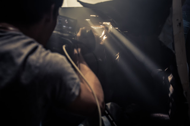
I showed a late draft of our video to a few groups of people, and talked about it with them to attain some feedback that could potentially help get the video to a better standard.
enjoy.
Monday, 30 November 2015
Friday, 20 November 2015
Wednesday, 18 November 2015
Shooting Schedule
This is the shooting schedule we created for our shoot tomorrow, we will aim to stick religiously to this schedule as to maximise our time efficiency tomorrow, a copy has been given to our cast and crew so that everyone knows whats going on and for there to be no confusion as to where everyone needs to be at each significant time.
Monday, 16 November 2015
Digipaks and names
Today my group and I worked on the digipak for our music video, we also brainstormed names. We wanted to find a name that would be conventionally acceptable in the genre of the song we have chosen to make the music video for, something that embodied the angst and the grunge of the track, both phonetically and symbolically. We brainstormed various names, some of the favourites being: Plastic affliction, Twisted anarchy, and Tainted Torment.
We started to picture each of these names on a digipak that would match the visual themes of the video, however none of them really fit - we felt the names were a little too similar to those you would expect from a death metal band, the prodigy's genre of music is big-beat/electronic rock and therefore doesn't entirely suit the names we came up with. I researched the synonyms of "affliction" and found the word "Crux" in the results. Crux is defined as follows: " something that torments by its puzzling nature; a perplexing difficulty."
We really liked this as the word phonetically sounds angsty and aggressive, with the inner meaning being quite edgy and dark it seemed like the perfect name for our band.
So we set about designing the logo.


We came up with some initial designs for both the digipaks and the band logo:


 A few of these designs really stood out to us, for example the album covers where we focused on people rather than a landscape or simply the band logo. The two best designs were: A man screaming to the left of the frame with the word crux vertically typed to the right hand side of the frame. And a chiaroscuro portrait of someone with their eyes closed, their face half in the shade with a tattoo of the word crux vertically typed down his face beneath his left eye.
The next job on the list was to create a stencil for the band logo which would be spray painted all over the walls of the grimy boys scene.
 Overall my group and I were very satisfied at our progress with the band name and the digipak ideas.
Subscribe to:
Posts (Atom)


